Announcing the New Era of the Technology Association of Oregon
In the dynamic world of technology, adaptation and evolution are not just strategies but necessities for survival and growth. In line with this, the Technology Association of Oregon (TAO) is proud to announce its recent comprehensive rebranding, signifying a pivotal evolution in its journey. This transformation is not merely aesthetic but deeply symbolic, reflecting TAO’s maturity, expanded influence, and unwavering commitment to the Pacific Northwest’s tech community.
A Journey of Growth
Since its inception, TAO has evolved from the Software Association of Oregon (SAO) to a broad-reaching entity that champions the entire tech industry and its community beneficiaries. The rebranding initiative, undertaken in collaboration with Opus Creative, the same minds behind the original TAO brand, marks a new decade of innovation, support, and leadership within the tech industry of Oregon and Southwest Washington.
The motivation behind this rebrand was multifaceted. While once cutting-edge, the previous logo and brand identity no longer encapsulated the association’s breadth of operations, ambitions, and serious engagement with industry leaders that TAO is known for today. “It started to feel like we’d outgrown our logo, and we needed to put a new look to all the great work we’ve been doing to not only support our members’ entrance into the sector but advocate for the policy that makes it easier and more enjoyable to do business in the Pacific Northwest,” says TAO Chief Operating Officer, Tim Winner.
A New Vision for the Future
The rebranding process was a thoughtful journey back to the drawing board, exploring both the maturity and geography that define TAO’s influence. The result is a brand identity that represents the next ten years of growth, emphasizing maturity, connection, and purpose.
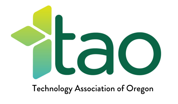
The new forest green color scheme draws inspiration from the natural beauty of the Pacific Northwest, moving away from the need for bright colors to stand out to a more grounded and sophisticated palette that reflects the work TAO does.
TAO’s evolution is not just in name or color but in its deep-rooted commitment to the tech industry and the communities it serves. From its advocacy work in education and policy at various government levels to its efforts to foster a robust tech industry, TAO has developed a reputation for quality and commitment. The new brand reflects this growth and is rooted in supporting the Pacific Northwest and all its members through connecting, represented by the new design and logo.

The new TAO logo features the quintessential green color palette of the Pacific Northwest forest, with a matured and simplified look and feel.
Reflecting on the Past to Innovate for the Future
The transition from the Software Association of Oregon to TAO marked the association’s first major rebrand, adopting bright neon colors and a logo designed for recognition. The latest rebranding celebrates TAO’s expanded role and impact, moving towards a sophisticated representation that aligns with its current stature and future aspirations.
The new logo, featuring a deconstructed 3D box, symbolizes the forward-thinking nature of the TAO community. It reflects the industry’s innovative spirit and collective strength with a color palette that captures the diverse environment of the Pacific Northwest. This new identity is a testament to TAO’s journey, embracing the changes in the community, business needs, and technology itself.
See the Rebrand Live: Mark Your Calendars for the 40th Annual TAO Awards.
With this rebranding, TAO is looking inward and forward, inviting members and the broader community to engage with its new identity.
The upcoming 40th Annual TAO Awards will be a celebration of this new chapter, embodying the spirit of growth and collaboration that TAO stands for. It’s an opportunity for the tech community to come together, recognize achievements, and look ahead to the future of innovation in the Pacific Northwest.
Registration for the 40th Annual TAO Awards will open on March 6th.
To nominate a company you’d like to see acknowledged, visit here (applications close on March 15th).
A Special Thanks to Opus Creative: A Partnership Rooted in Vision and History
TAO’s partnership with Opus Creative has been instrumental in both the past and present branding efforts. This collaboration underscores a shared understanding of TAO’s mission and the evolving landscape of the tech industry in the region. The rebranding is more than a visual makeover; it’s a strategic move that aligns with TAO’s role as a reflection of the regional tech industry it supports.
Embracing the New TAO
The new TAO branding is a bold step into the future, signifying the association’s readiness to lead and innovate in an ever-changing industry. It’s a reflection of growth, maturity, and the purpose-driven mission to support the tech community in the Pacific Northwest. As TAO embarks on this new chapter, it invites its members and the broader community to celebrate this milestone and contribute to the ongoing journey of innovation, connection, and purpose.
This blog was written by Taylor Victoria Maurits at Wise UP PR.
Join our movement in the world of tech
Become a part of our mission to empower the tech community in Oregon and SW Washington.